Central Dalmatia
Public Competition
The second prize at HDD's competition (Croatian Designers Association) for the design of the visual identity of the Tourist Board of Split-Dalmatian County.
Concept / Harmony of Contrasts
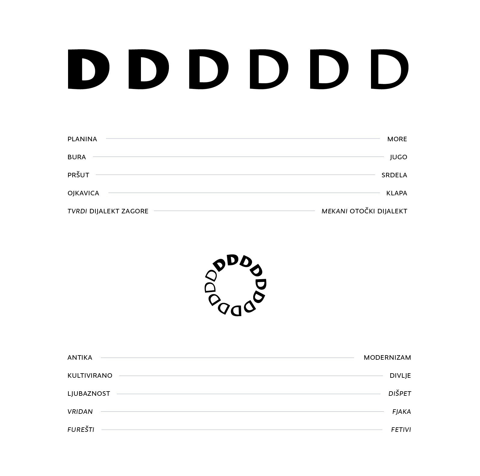
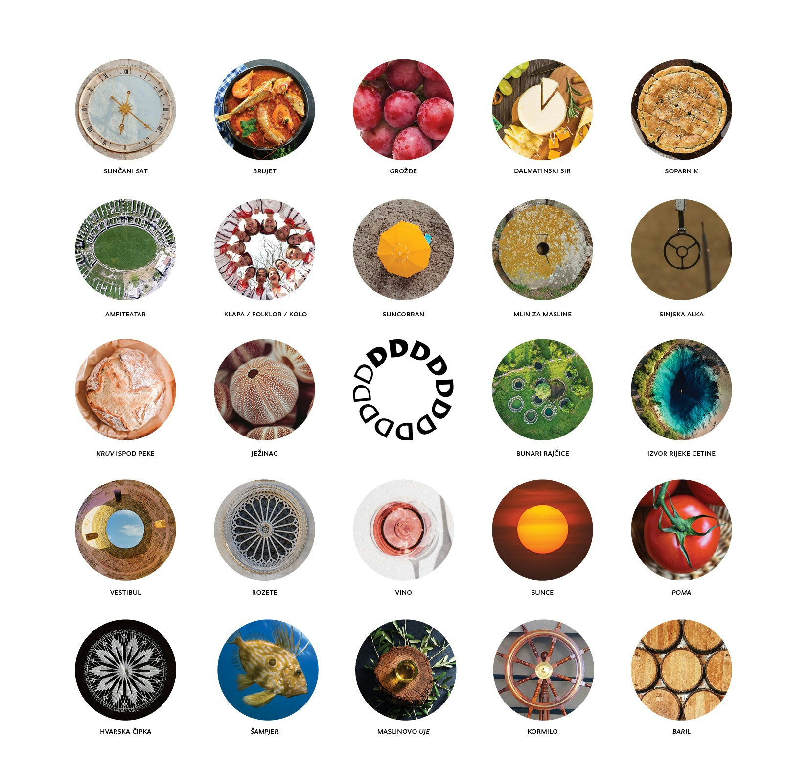
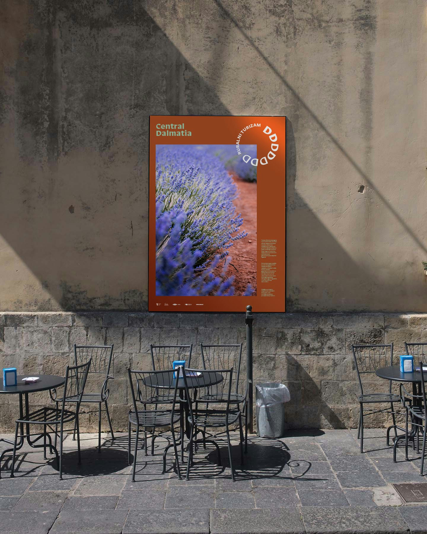
From the atonality of “Rera” and “Ojkanje” to the harmony of “Klapa” singing, Dalmatia is a place of pronounced contrast and dynamic diversity. This idea extends from the context of geomorphology to culture, architecture, and even dietary habits. Life in this region has thrived since ancient times in a circular, repetitive rhythm, bathed in sunshine for most of the year. Translating these thoughts about Dalmatia, a symbol was created that is both complete and contrasting in itself.
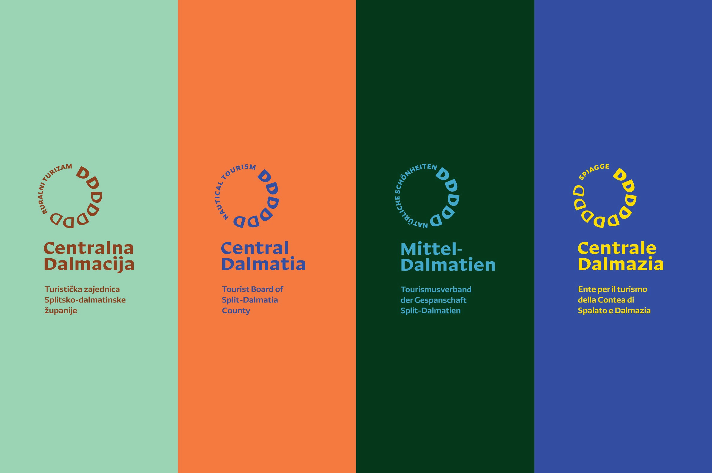
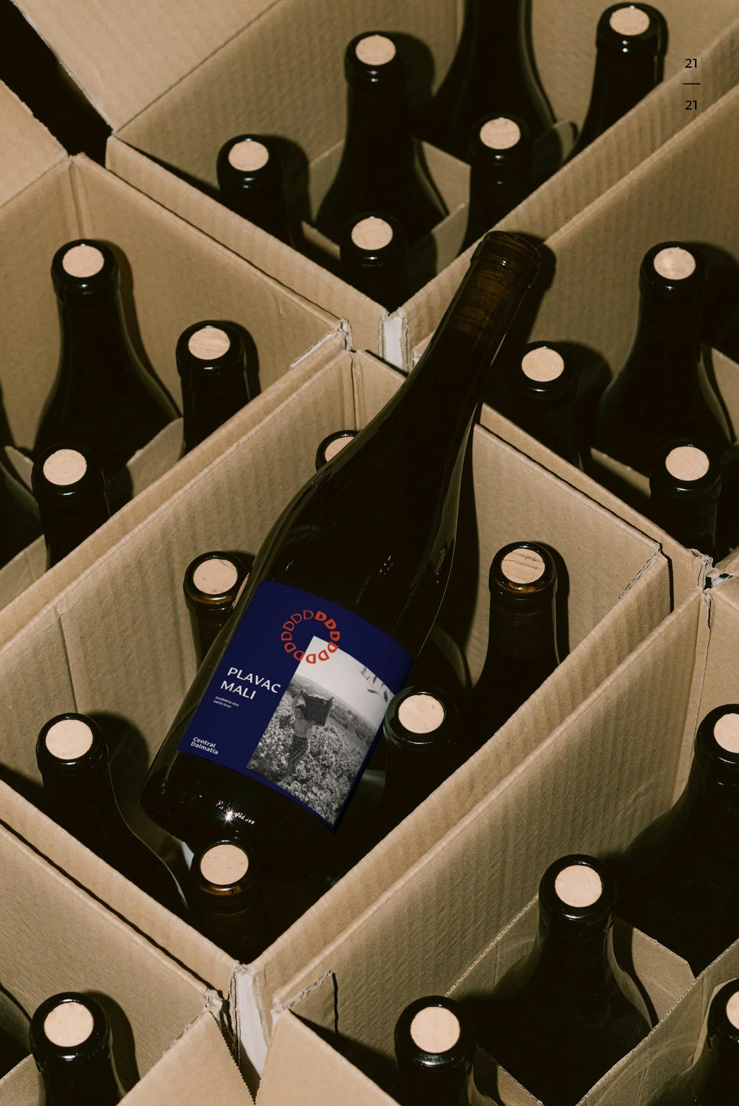
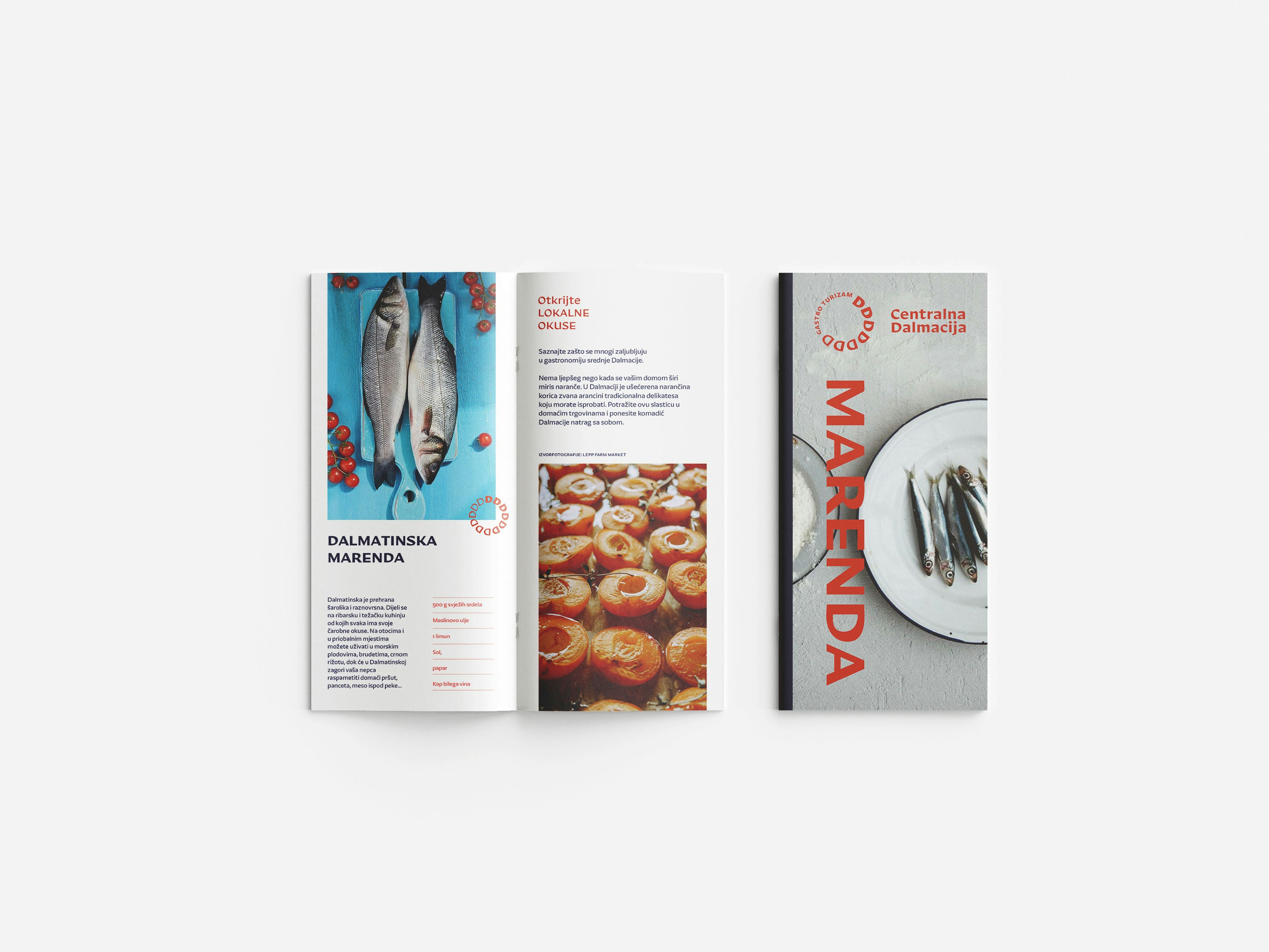
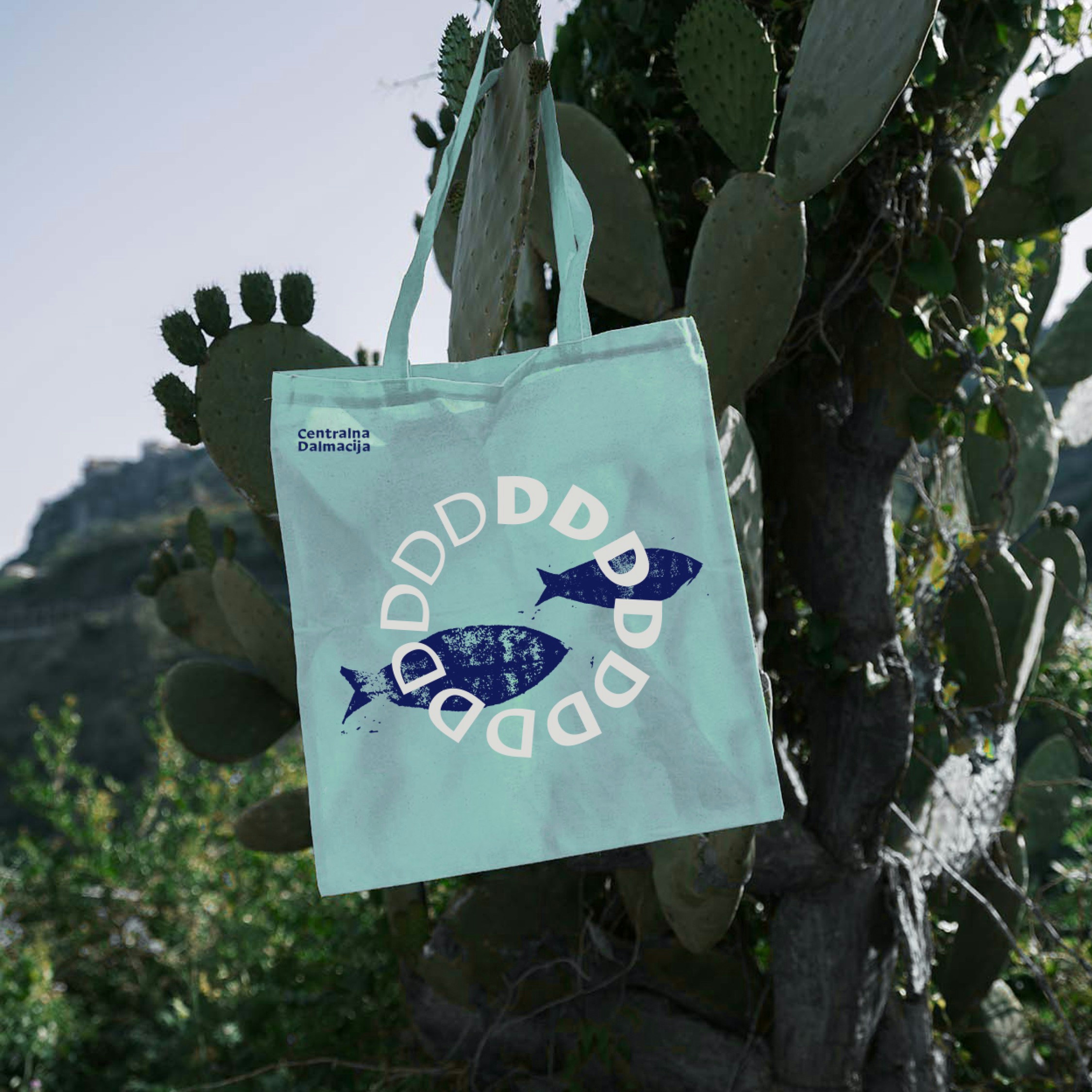
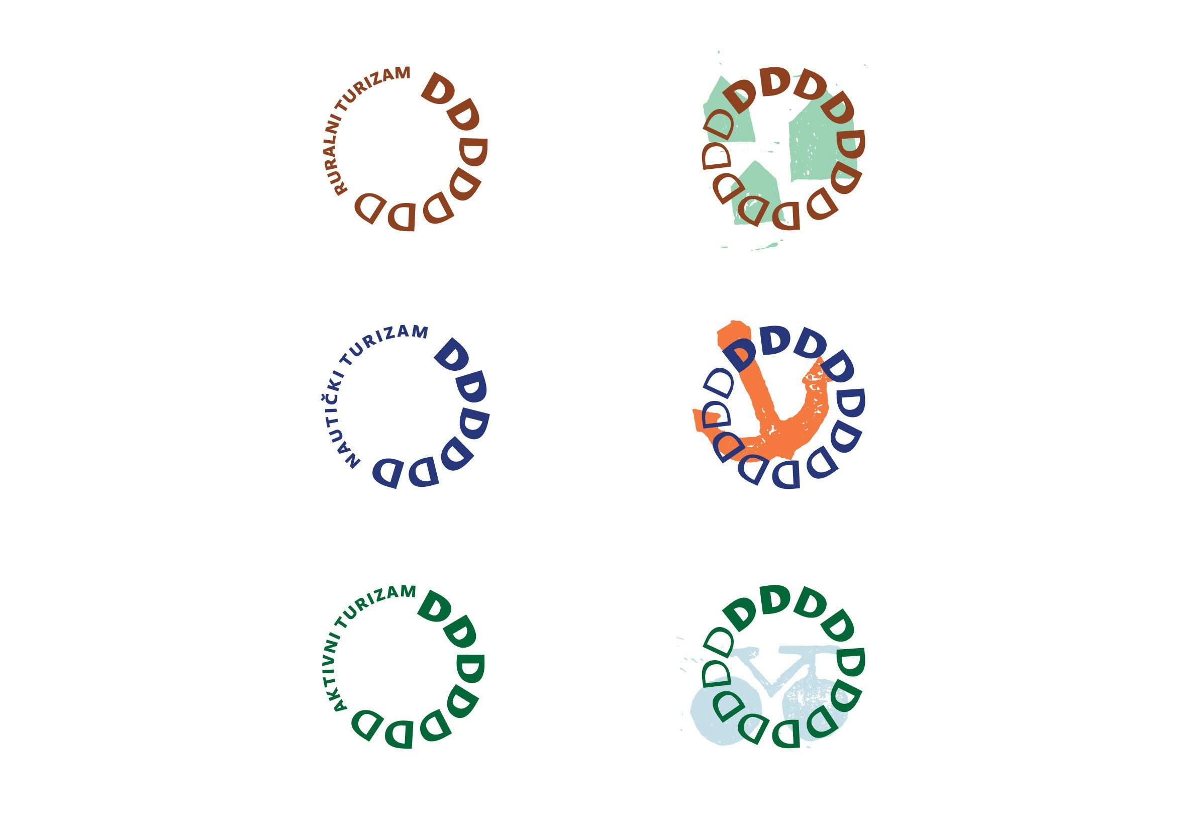
By repeating the initial "D", a circle, which symbolically represents primarily the sun but also serves as a metaphor for the simultaneous gentleness and harshness of this part of Croatia, is formed. The choice of a sans-serif, contrasting typography emphasizes the idea even in the base of the letter form from which the symbol is created. This is further emphasized by the graduated intensification of the letter stroke within the symbol. With its structure, the symbol strongly communicates the playfulness and vibrancy of Dalmatia. The strategic desire for a balanced tourist offer, appealing to visitors throughout the year, is subtly implemented in a symbol composed of 12 parts. These parts represent seasonality—a major challenge for tourism professionals. The selection of geometric and stable elements and modern typographies achieves a contemporary look that is not compromised by trends, guaranteeing longevity and freshness of the identity. The form itself opens up great potential for application in dynamic, animated formats.
- Kreativni tim
Karlo Kazinoti
Mišo Komenda
Ana Bodrožić
Frane Balta
Bruno Dubravec
Hana Malenica
