Barone Fortress
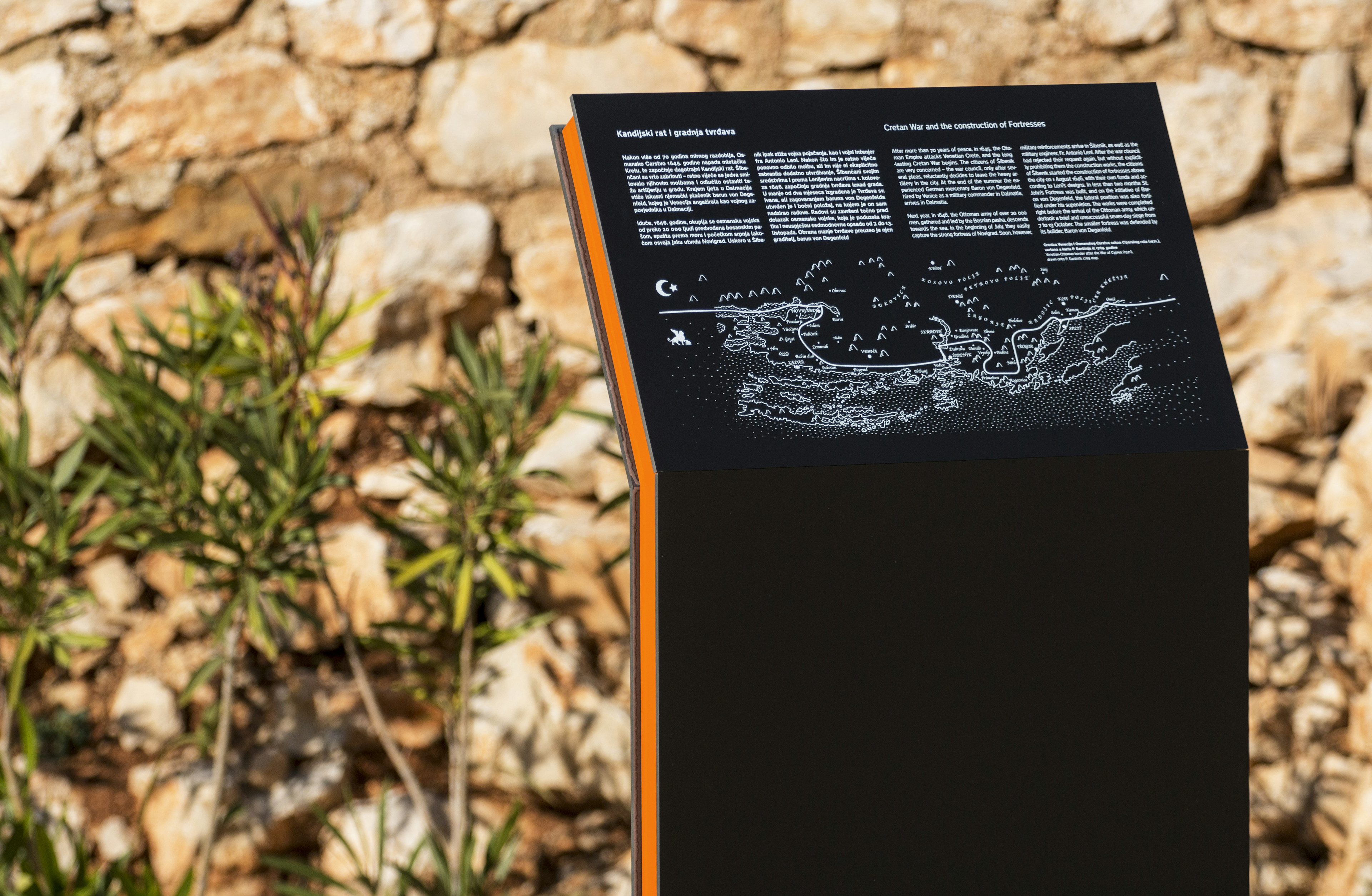
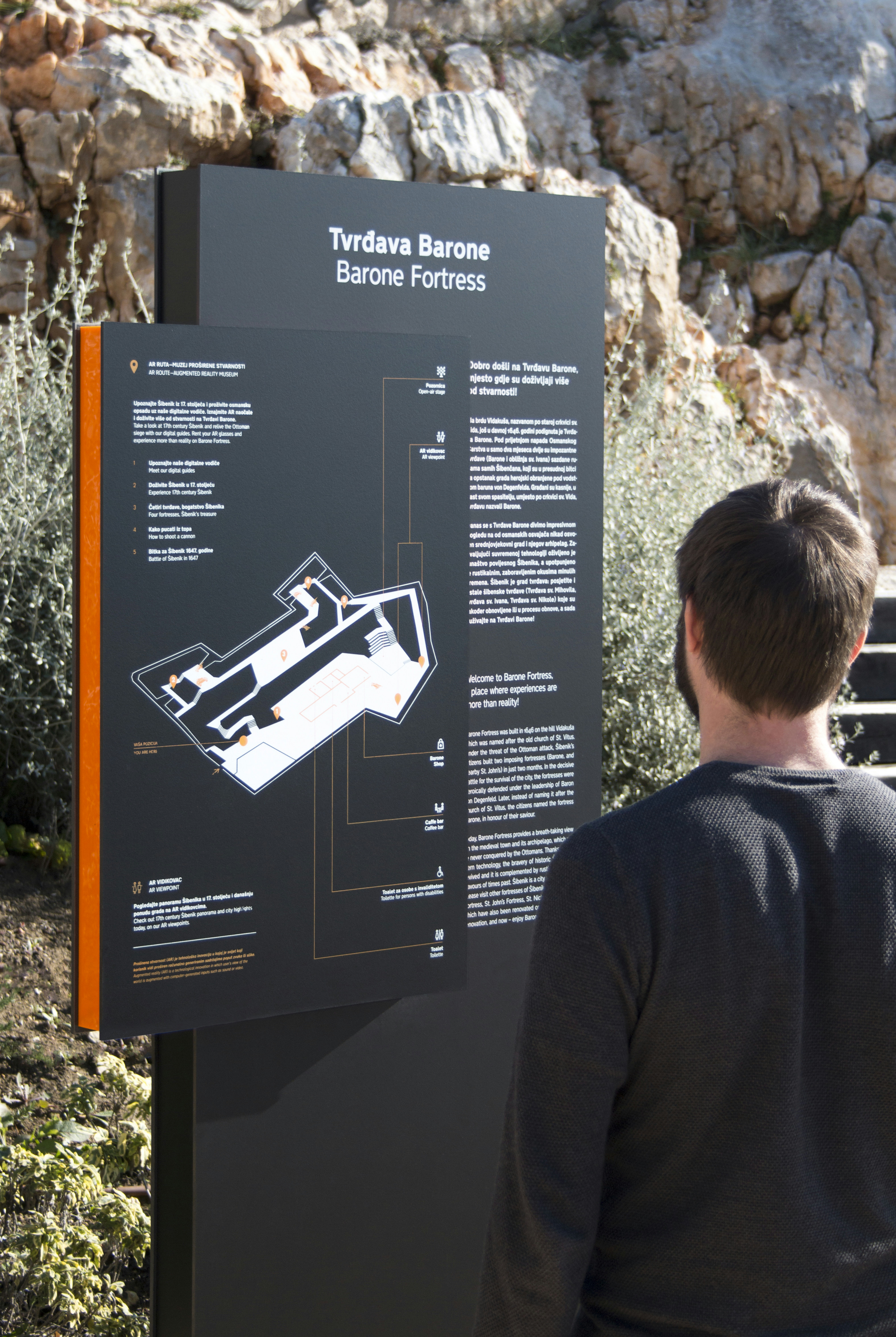
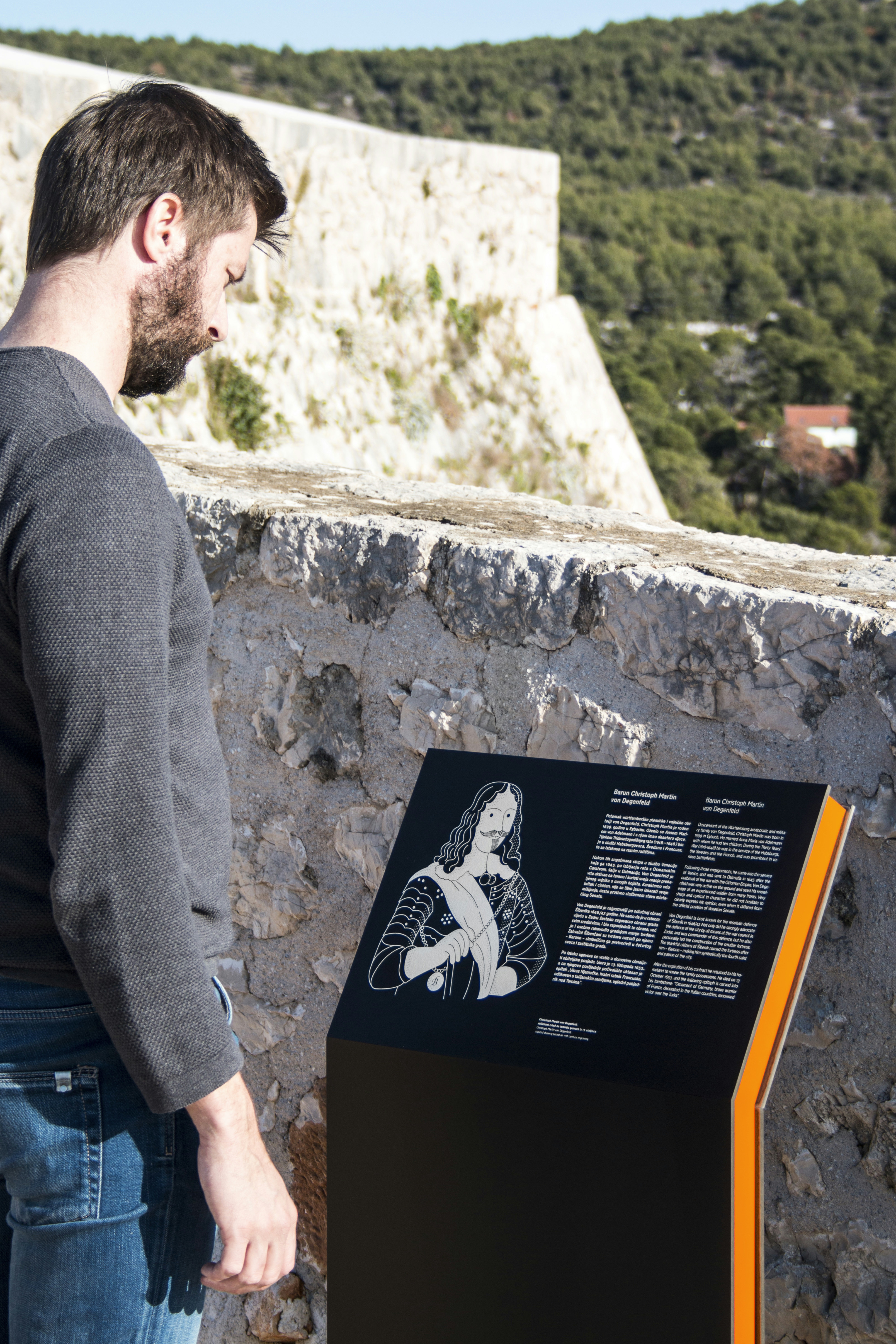
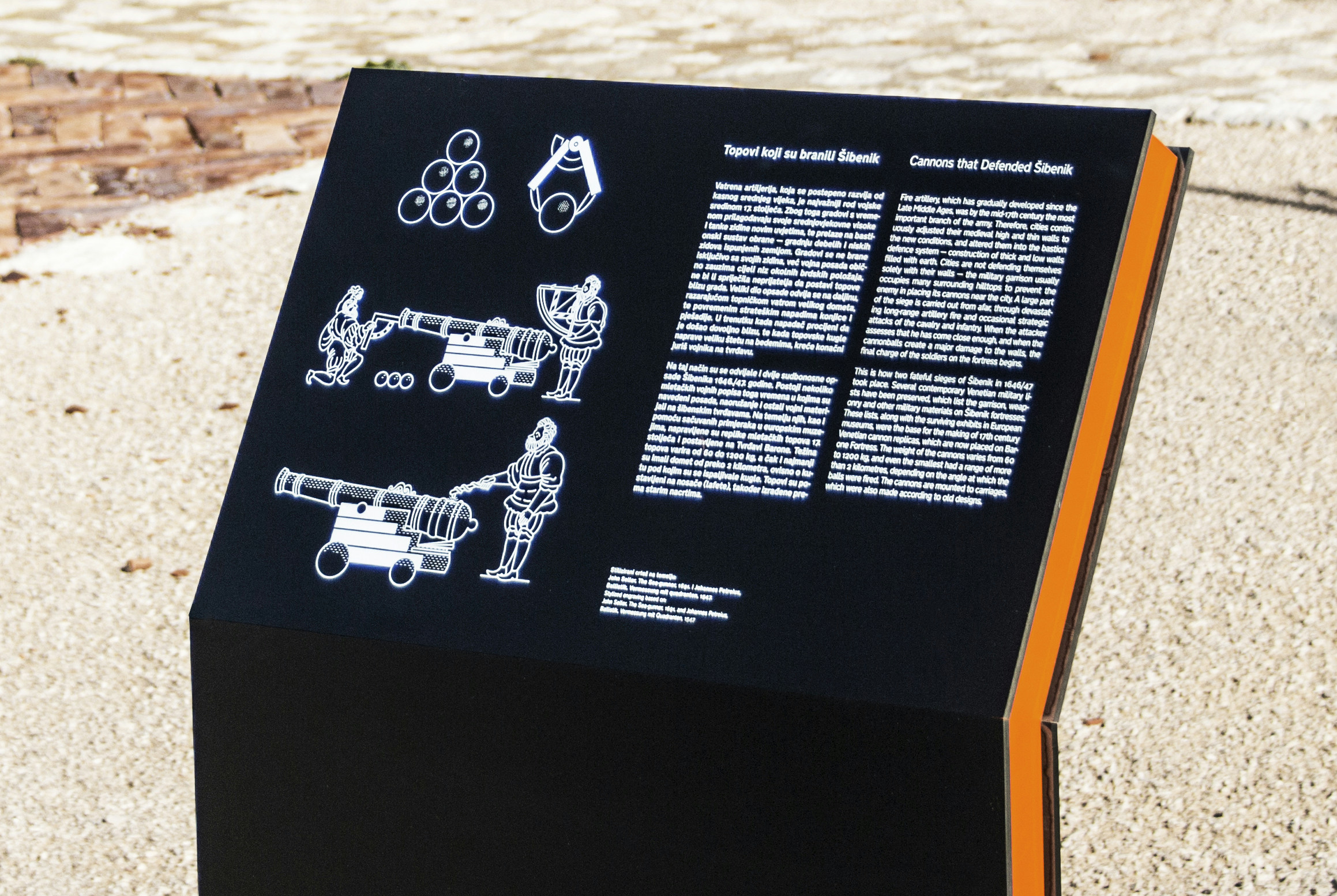
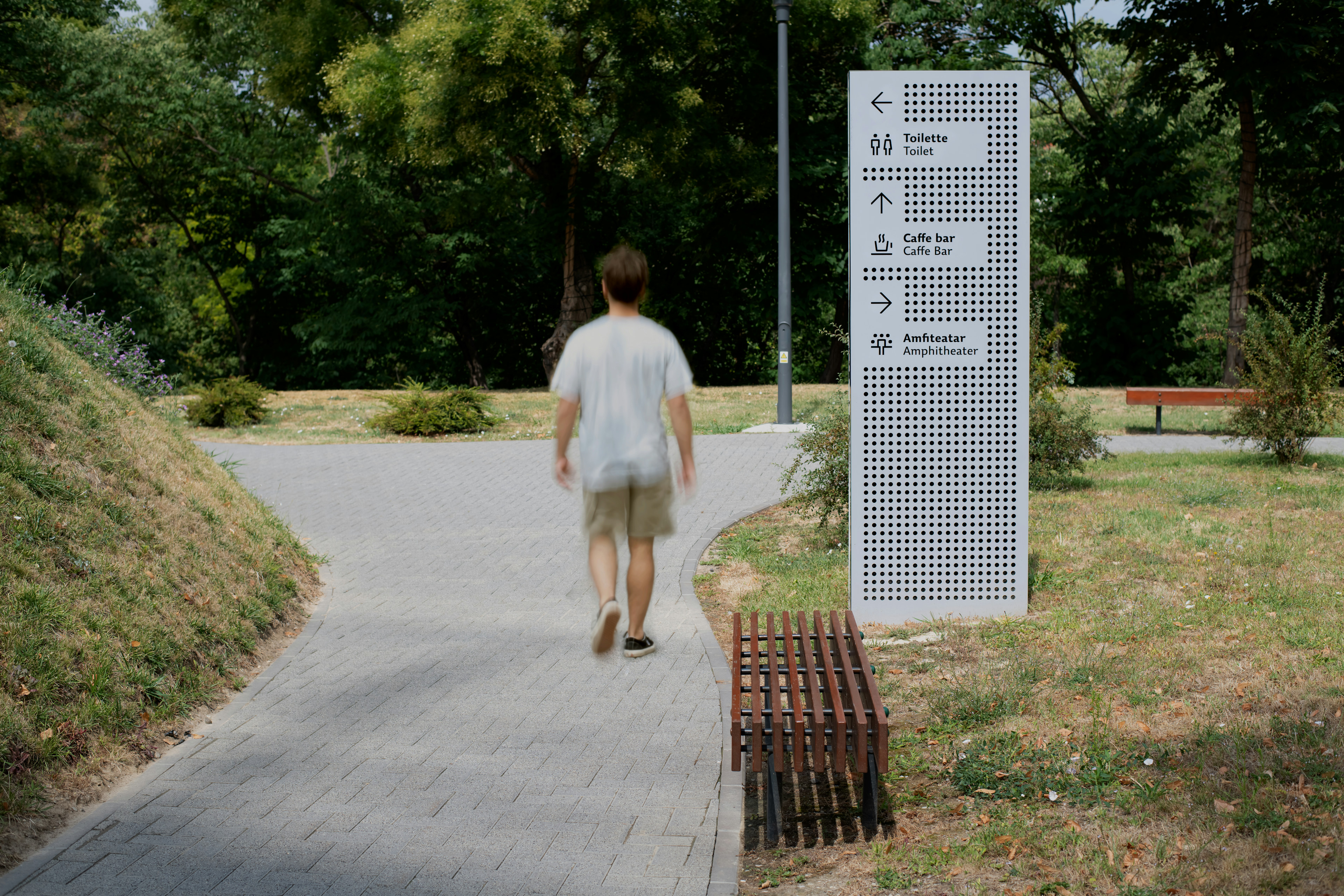
The signage concept is inspired by the multitude of preserved walls and the ground plan of the fortress in the form of an irregular quadrangle. Assuming that the fortification has never been fully completed because of possible future adaptations linked to advancement in war technology, the idea was to design the new layer holding the signage system in a way that it represents the 21st century.
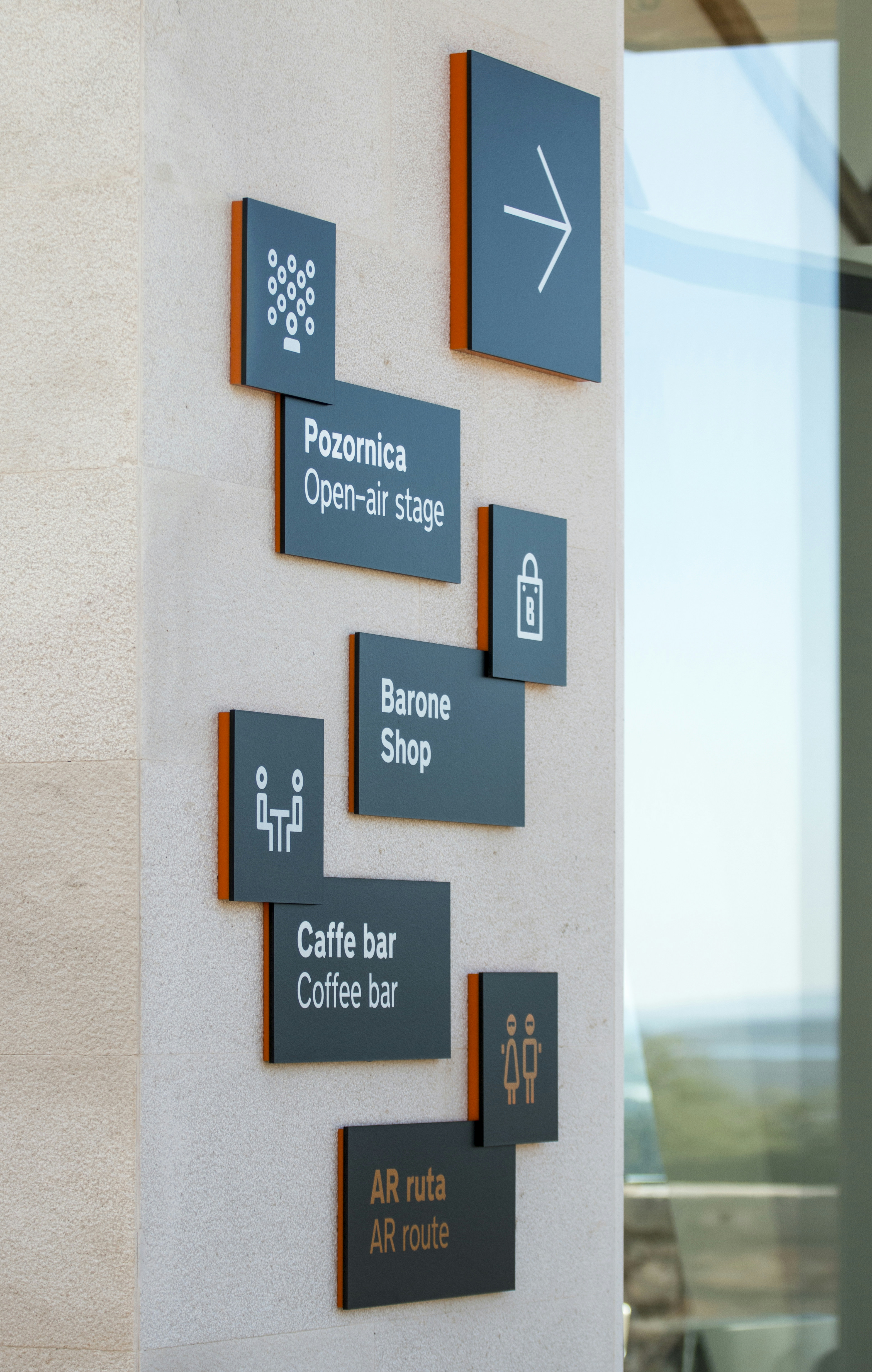
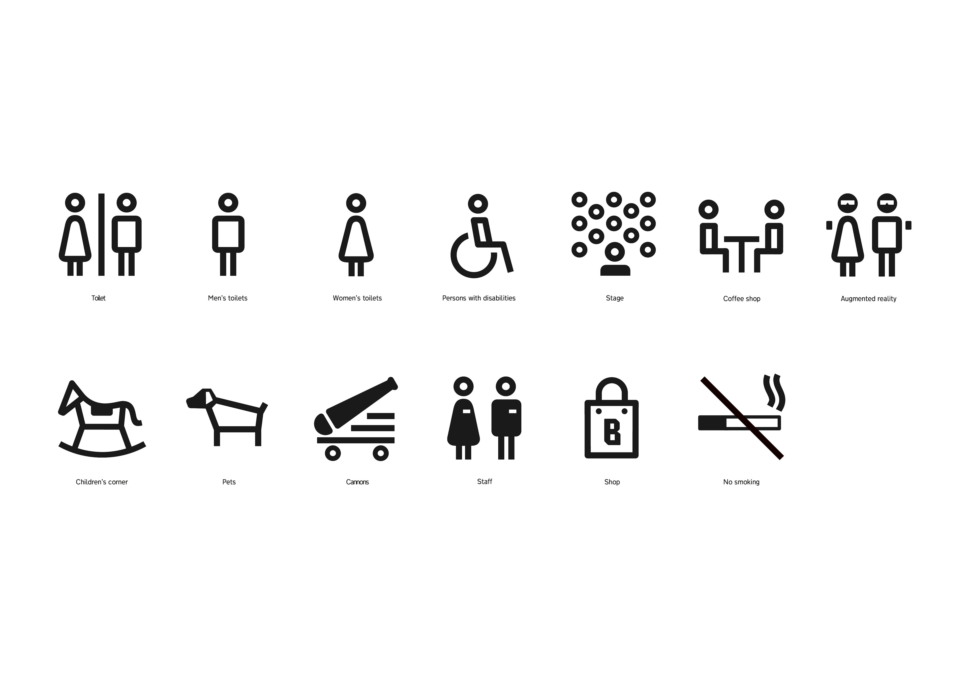
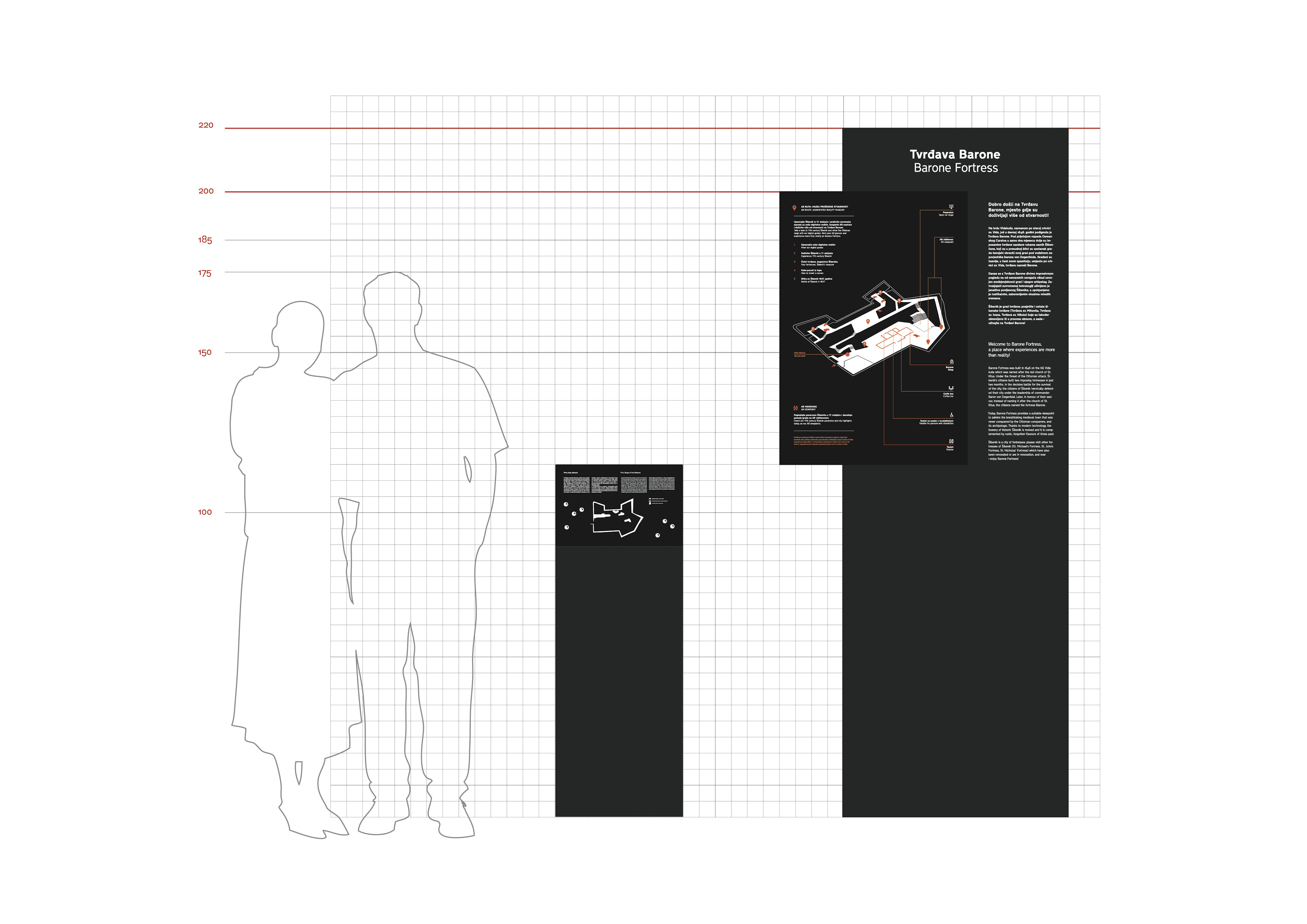
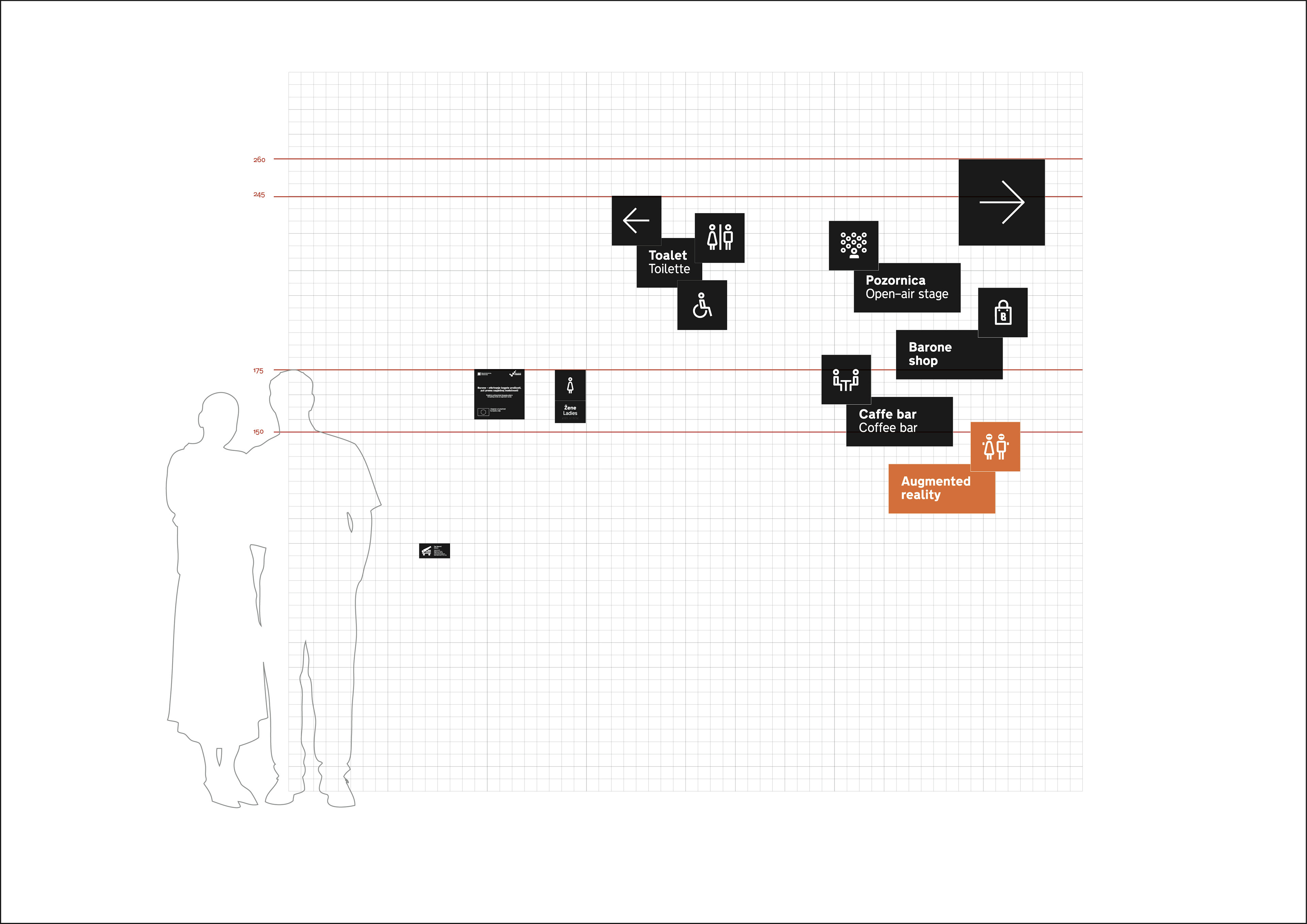
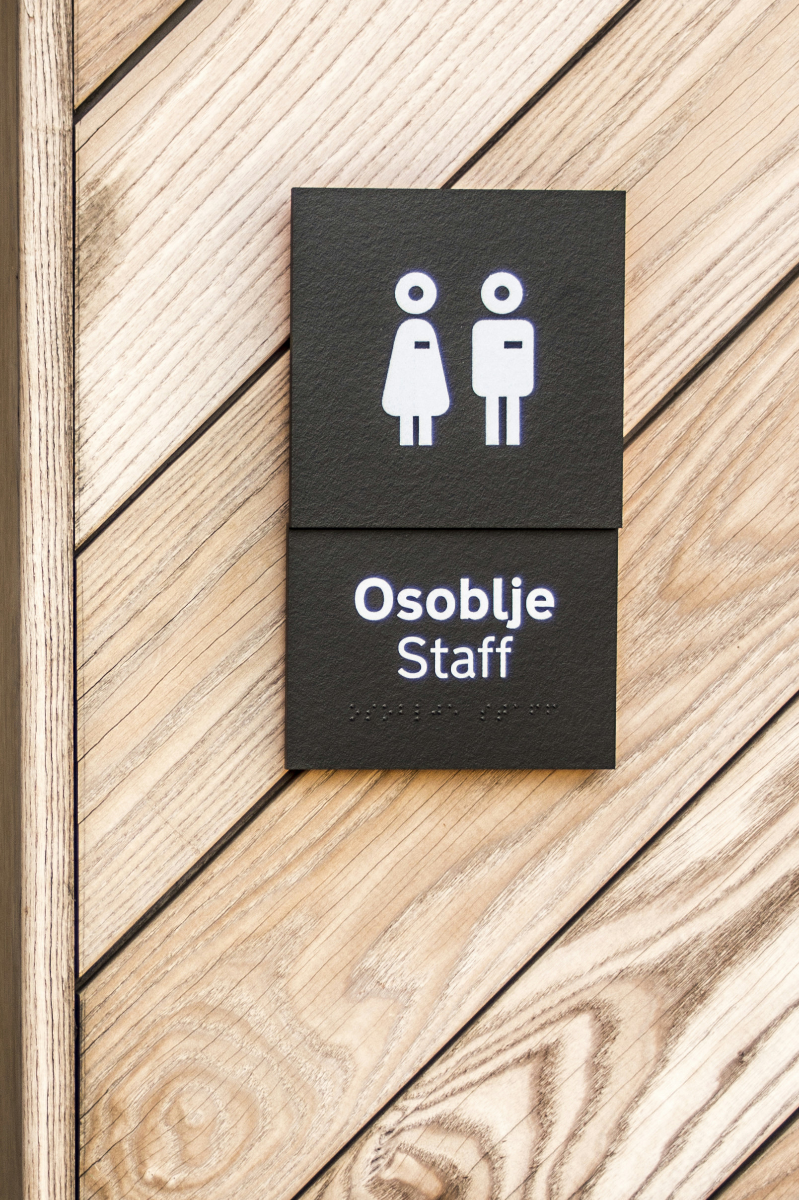
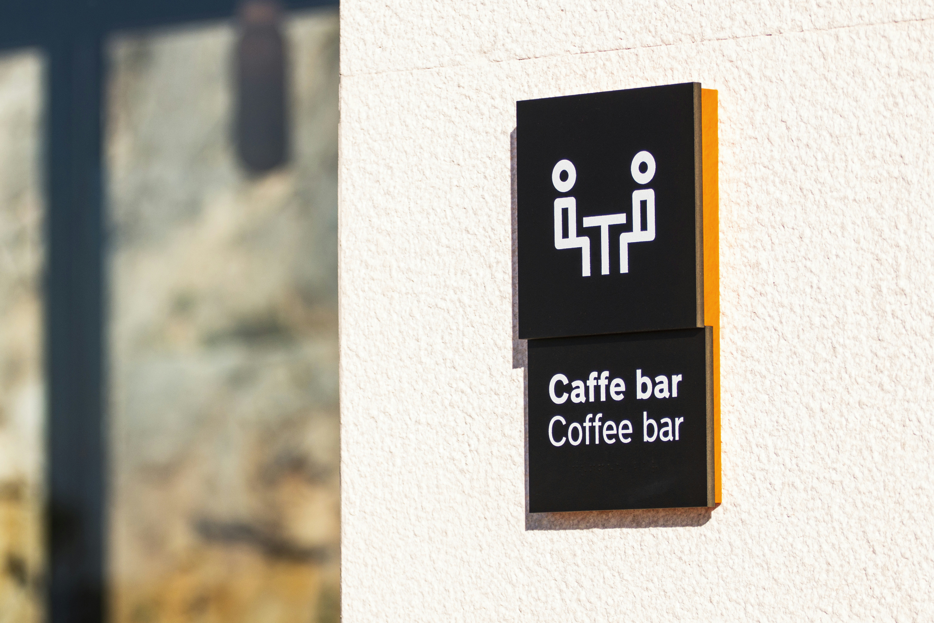
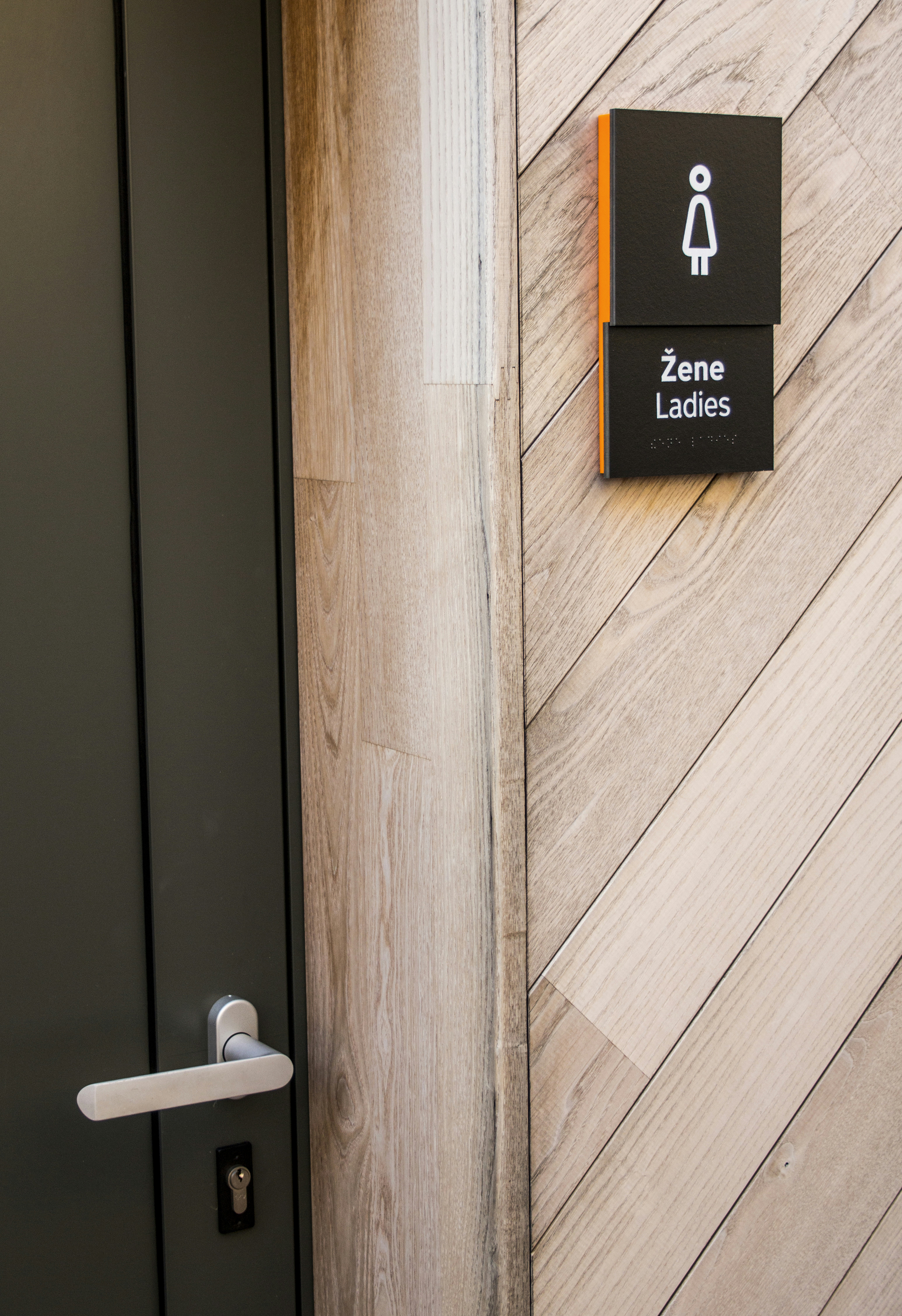
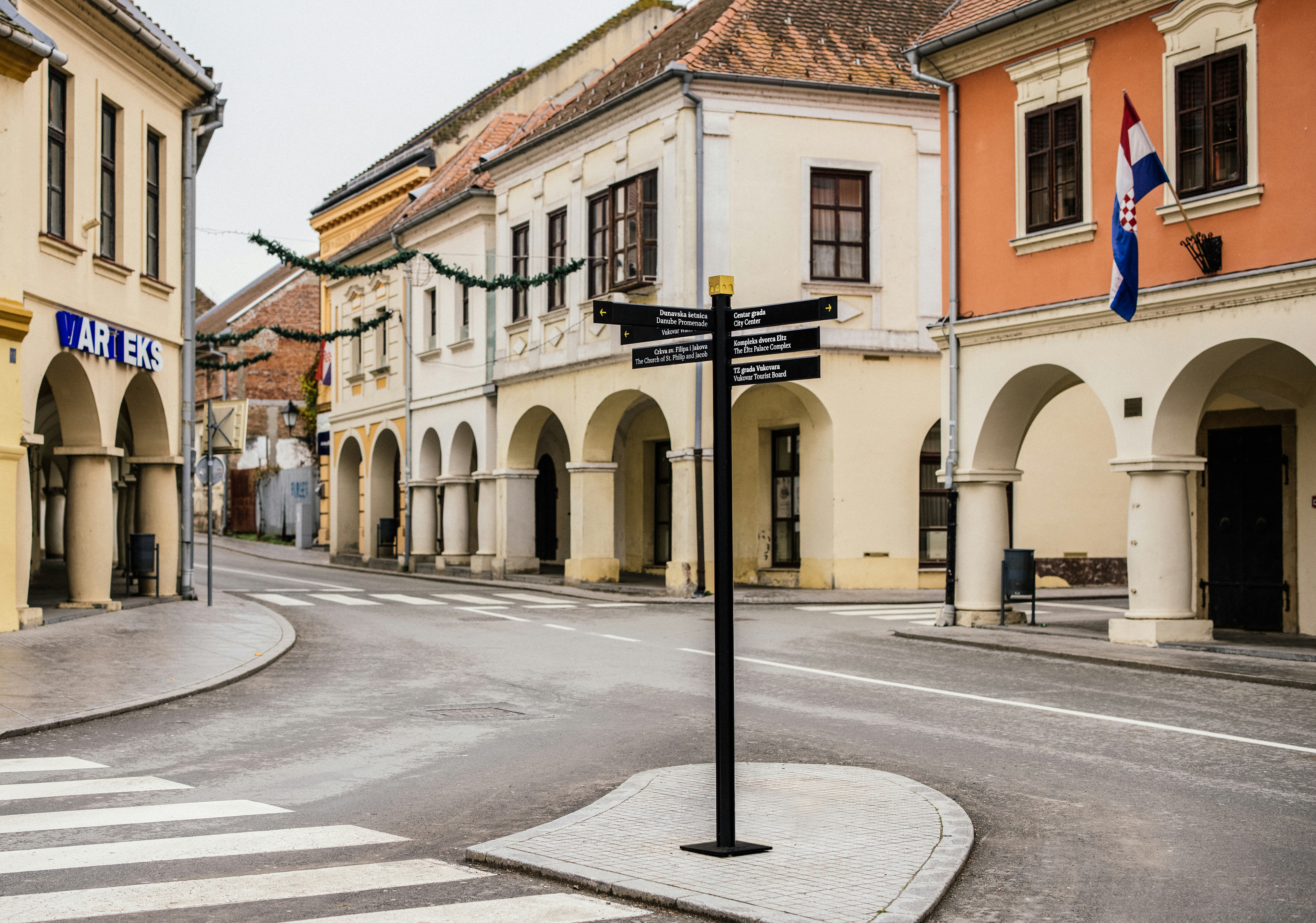
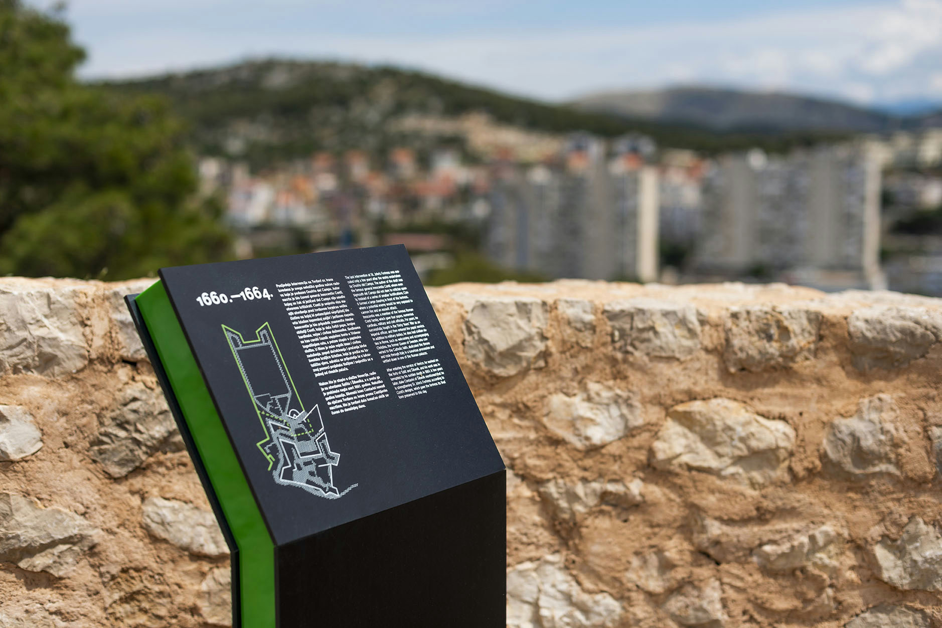
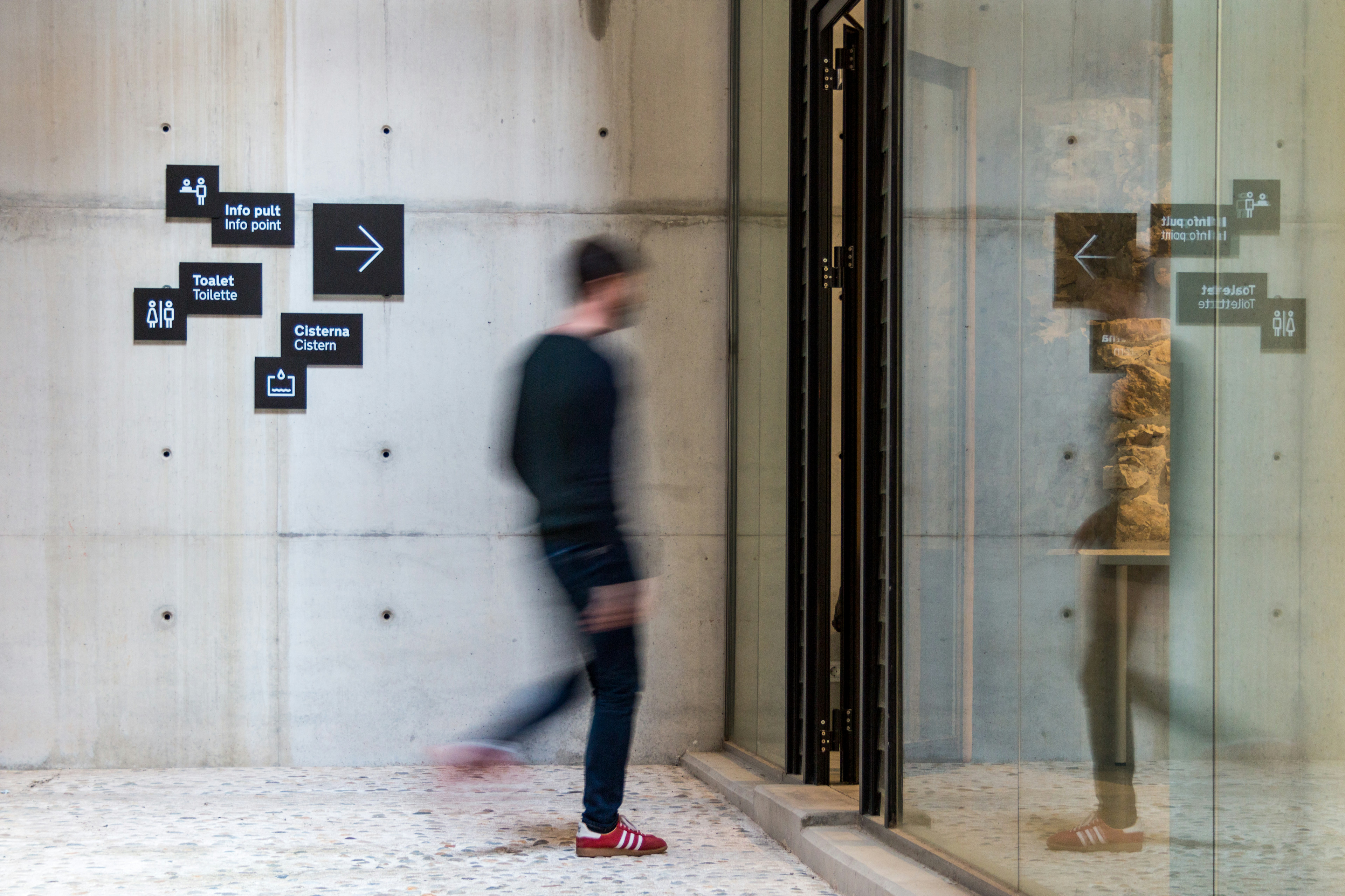
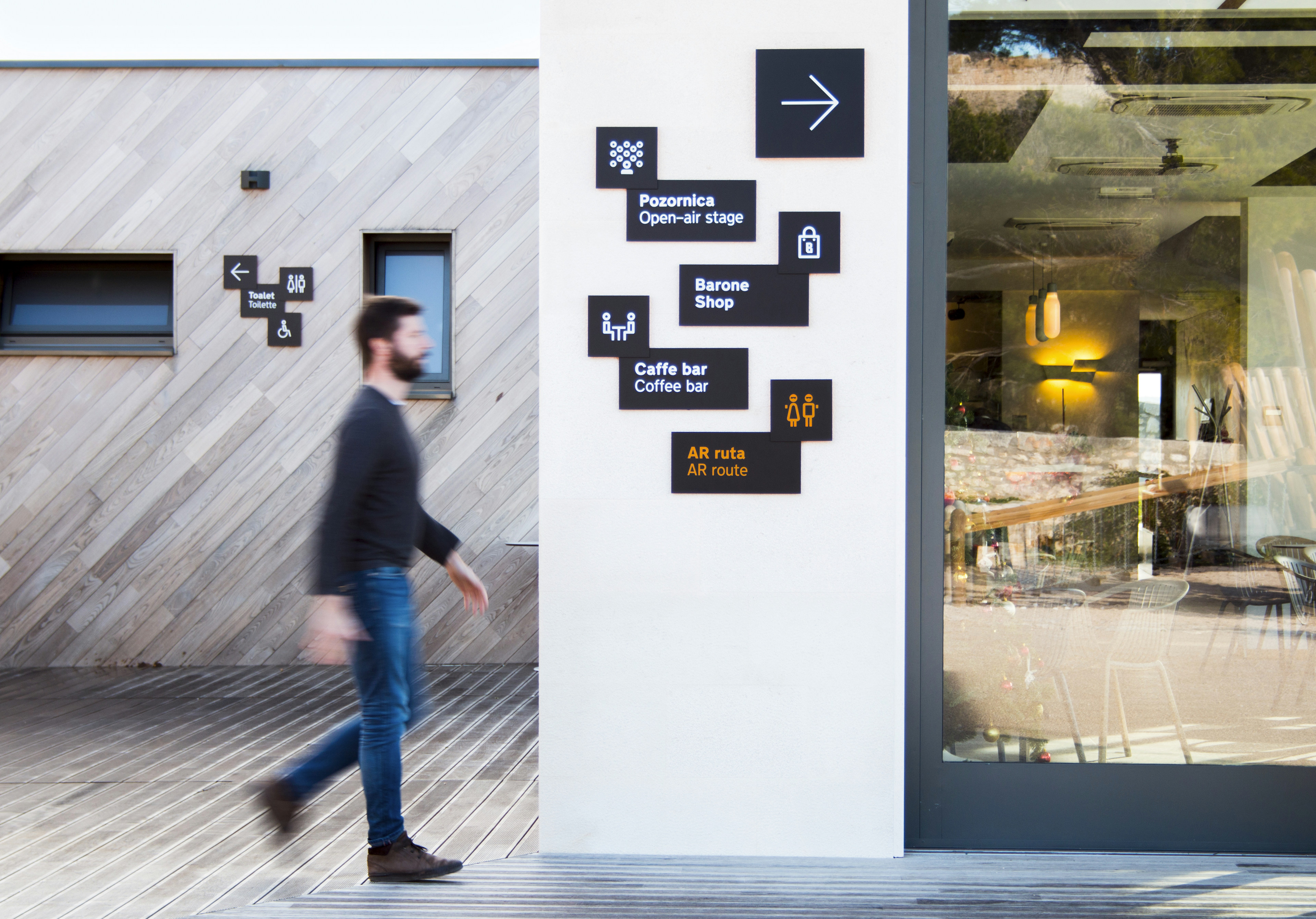
Visitors can obtain all necessary information or directions via three diffrent sign categories used for finding destination, orientation or information. During the design process, each character was given a functional layer, so that each layer contains a certain type od information - the text section is positioned on the lowest layer, while the arrow (the direction of movement) is at the highest one.
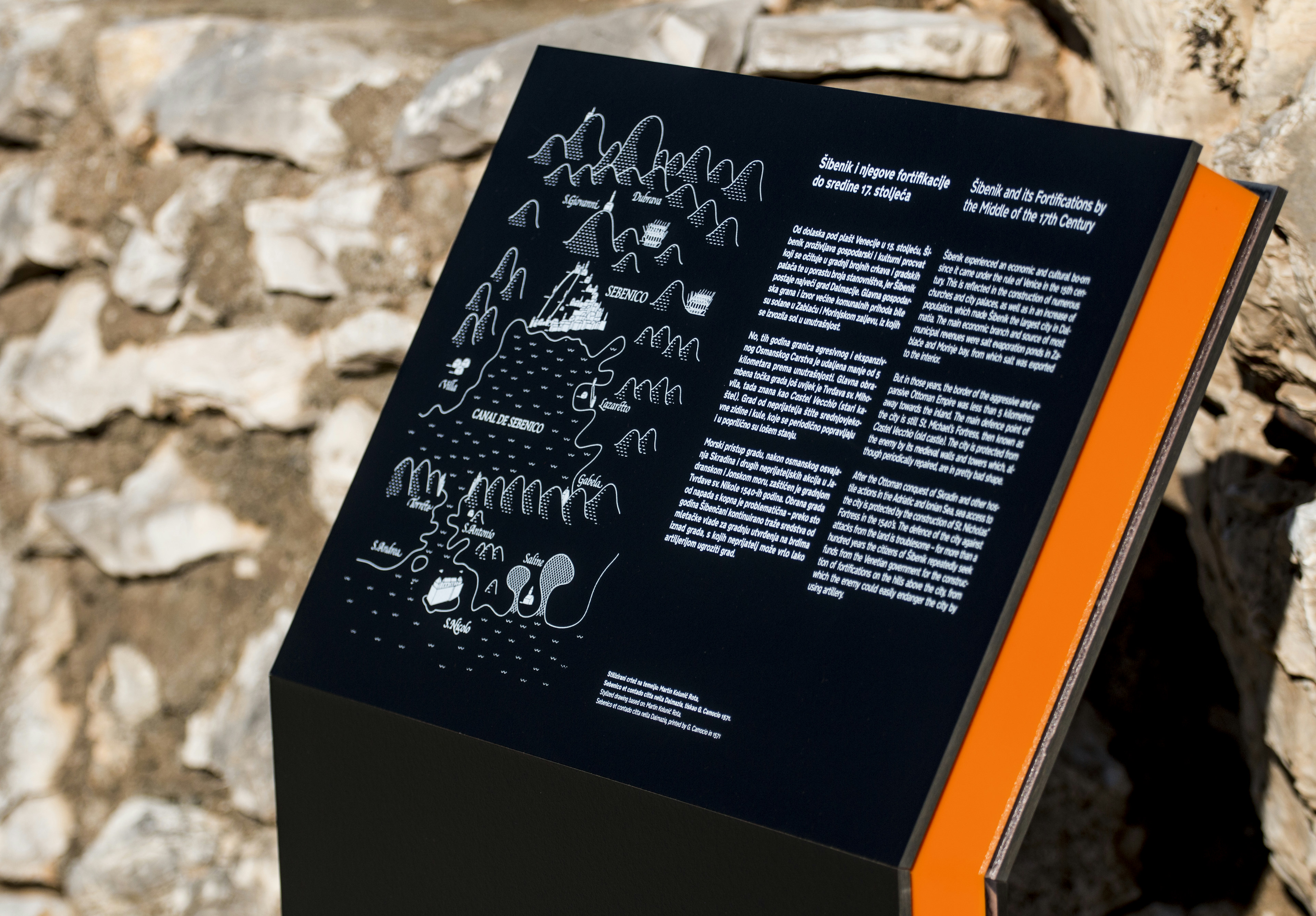
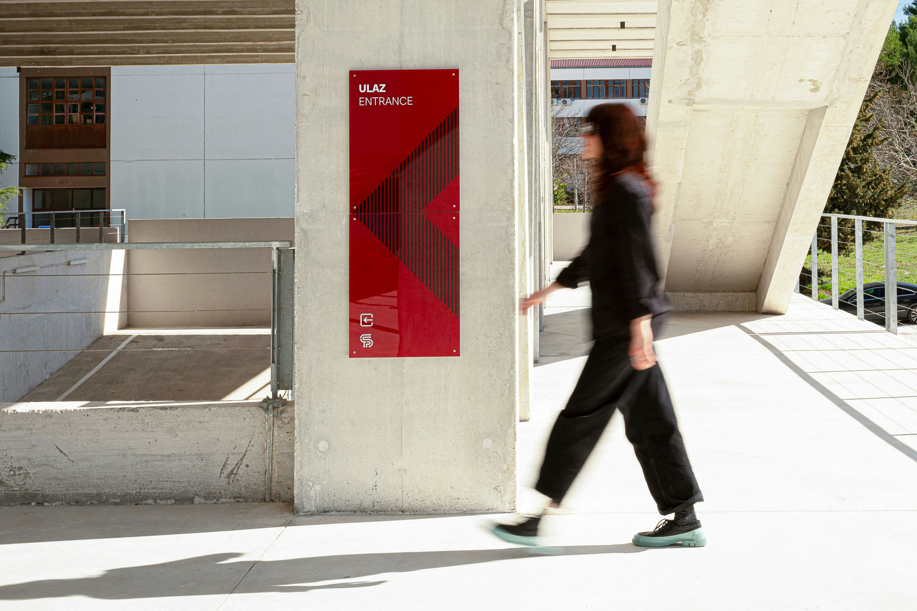
Since this signage system is applied to all the fortresses in Šibenik, the distinction between them is established with use of different colours which are defined by their visual identity.
- Coauthor
- Iris Klarić
- Client
- Fortress of Culture Šibenik
