Spring + Shift
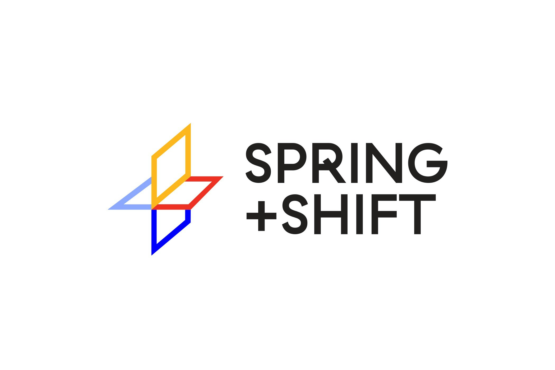
The plus symbol represents connection while simultaneously symbolizing growth, progress, and innovation. This simple yet powerful sign reflects the dynamic nature of the Spring + Shift agency, which focuses on creating value through creative and strategic shifts. The three-dimensional nature of the plus sign emphasizes the interwoven services and ideas the agency offers while providing space for modular visual interpretations of various values, activities, and aspects that define its work. Every aspect of the agency can be represented through variations in shape and color, making the logo versatile and adaptable to different contexts.
The design of this logo achieves a sense of depth through the juxtaposition of conceptual planes within an orthogonal system. The planes are formed using contour lines, adding a sense of lightness, transparency, and flexibility. This approach to visual design aligns with the agency's philosophy, emphasizing adaptability and agility in business. The plus sign is not perceived as a static form but as a dynamic element in constant evolution. The planes, as modular units, can be reinterpreted in various combinations, creating a visual interplay that symbolizes the expansion and growth of the agency's services.
One of the key aspects of this logo is the careful selection of typography, which harmonizes with the design elements of the symbol. The font is modern, clear, and minimalistic, while still possessing enough character to support a strong brand presence. The sharp lines and gentle curves of the font reflect a balance between professionalism and creativity—core values of the Spring + Shift agency.
The colors used in the visual identity coding encompass various aspects of the company as well as its vision and values. Each color reflects specific qualities the agency aims to communicate:
Blue — symbolizes success, trust, and stability. This color suggests professionalism and excellence in services, which is essential in client relationships.
Red — represents motivation, energy, and action. It signals a strong dedication to work while evoking a sense of engagement.
Yellow —conveys enthusiasm and optimism. As a color that inspires energy, it reflects a proactive approach to working with clients and continually seeking new opportunities for growth and development.
Lavender — symbolizes creativity and innovation. It suggests freshness and originality.
This color palette is not just aesthetically appealing but deeply resonates with the agency's mission to continually grow, explore new possibilities, and provide solutions that drive change in the industries it serves.
- Suradnik
Ana Bodrožić
- Klijent
Hauska&Partneri


